La Sécurité Sociale
UCANSS, Union des Caisses Nationales de Sécurité Sociale, better known as Sécurité Sociale Française, is the French public body responsible for protection against life's risks (health, family, retirement).
How to modernize French Sociale Security and make it accessible to everyone?
-
🕒 Duration : January 2022 to June 2024
🤹 Role : Design Lead / Design Manager
🤝 Onepoint Team : Product Manager / Brand Design / UI Designer / UX Designer / Researcher
👥 Ucanss Team : Communication & Brand / IT & Tech / Recrutment
🔧 Tool : Figma - Maze - Notion
Context
In 2022, UCANSS called on Onepoint to transform 3 of its digital services.
- La Sécu' Recrute, the organization's main recruitment platform. Top 5 recruiter in France, with several thousand recruits a year, the platform attracts over 5 million unique visitors a year.
- La Bourse Immo, the property management service
- Le Lab Inno, the toolbox for innovation at the Sécu'
The aim of this work was not only to modernize the platforms, but also to become a benchmark for digital accessibility, while offering an impactful experience.
Why this project?
I have selected this project as case study for my portfolio for several reasons
- Full compliance with accessibility requirements (RGAA) for the recruitment platform. Audited and rewarded with a score of 100 out of 100.
- Support and skills training for UCANSS teams (Communications, IT Department) in Design methods and approach.
- Implementation of a Design Kit and then a Design System for a major public organization in France.
- Implementation of recurring user tests using the Maze tool.
- I was in charge of the Design team and design delivery.
- Due to budgetary constraints our approach was frugal.
Challenges
- A customer who was not very mature in terms of our approach to design, accessibility and development.
- A well-defined but challenging timeframe.
- Collaboration with UCANSS technical teams to create a viable and accessible product.
- A new coprporate identity designed by Agence Dragon Rouge, but no digital interpretation of it.
- UCANSS websites and digital platforms had poor SEO and ergonomics that were not adapted to most types of device.
My role
In charge of the project and design team, I was responsible for strategy and design delivery.
On this type of project, I also have to manage the relationship with the customer and his teams.
So I was there from the beginning of the scoping phase right through to supporting the UCANSS technical teams in implementing the technology.
I also determined the design approach based on the customer's brief, our convictions and his budget.
The Process
Our approach with the Design team could vary from one product to another. For example, for the La Secu' Recrute platform, the approach was as follows.
- Start with an in-depth audit of the interfaces, content and all existing digital elements of Sécurité Sociale
- Take the time to understand in depth the technical stakes in this public ecosystem. We understand the constraints, so it's important to take them into account as early as possible.
- Personae definition and user journey mapping
- In parallel with this work, work on the identity to make it viable on the interfaces and of course some benchmarks.
- Initialization Design System (Foundation, Tokens, Governance).
- Co-construction workshops for structure and flows with stakeholders.
- Design conception (zoning, wireframes, high-fidelity interfaces).
- User Testing & iteration.
- User journey Mapping

- Personae
Key Design Momentum
This case study can be approached in several ways, but I've chosen to zoom in on what seems to me to have been the most structuring.
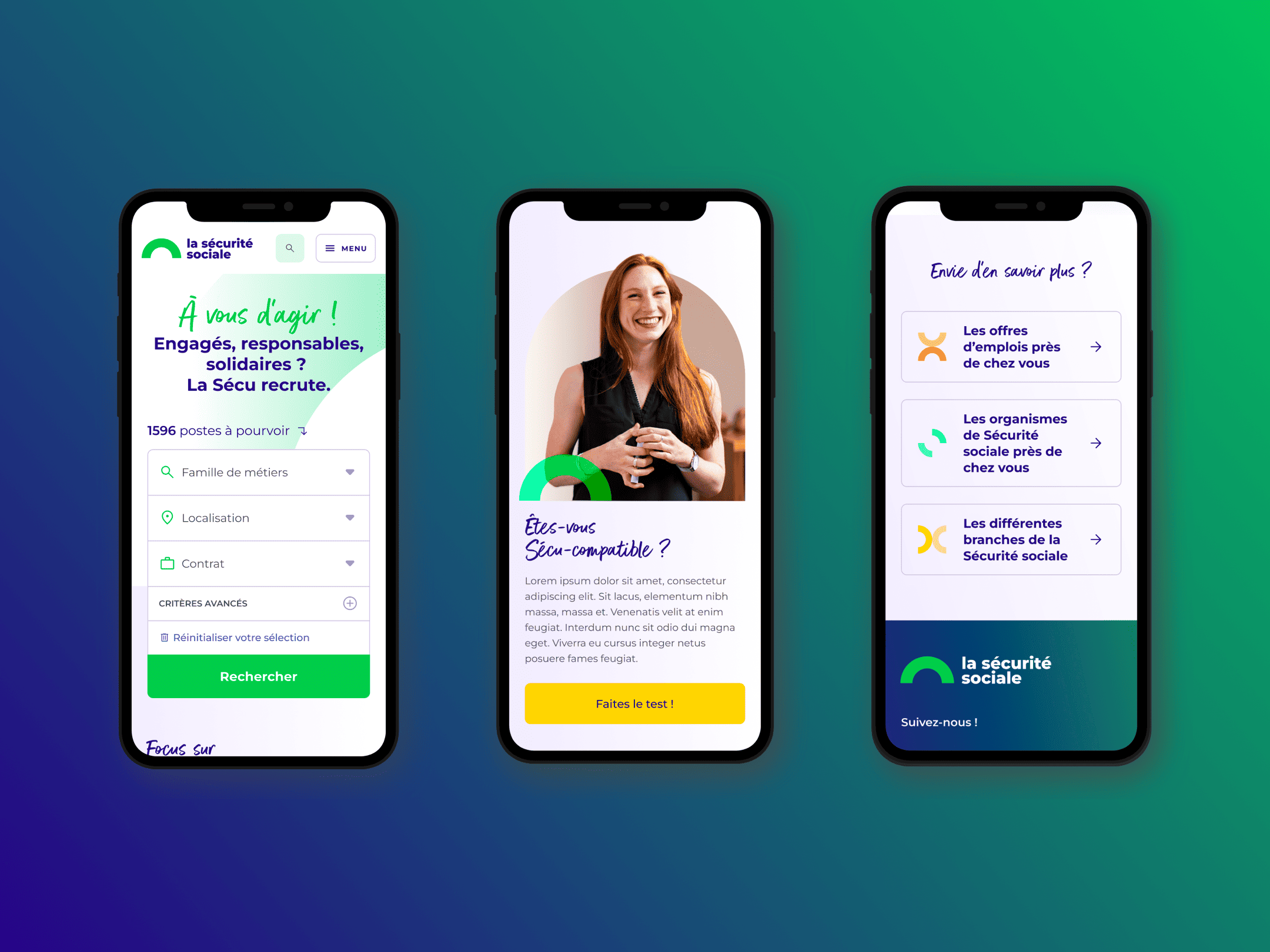
Simplifying candidates journey
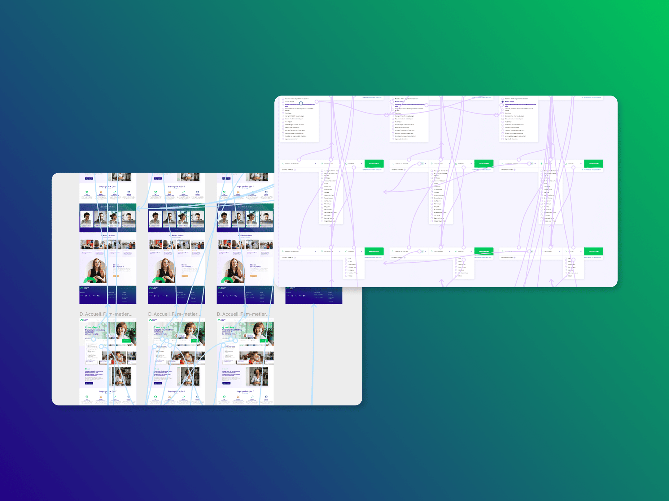
One of the key points in the redesign of the recruitment site was to de-complexify the application process. Put like that, it may sound simple, but you have to imagine a site that has several hundred or even thousands of job offers simultaneously.
Together with the team, we set out to overhaul the entire structure, tree structure and application paths of the current platform, because even though we wanted to completely overhaul the application paths, we were highly dependent on the UCANSS entities.
How do we do it?
Internal workshops with the team were an excellent way of challenging these elements: card sorting, prioritization matrix and other methods helped us see things more clearly.
In concrete terms, what we did first was to drastically reduce the number of steps involved in accessing offers and applying for them. Secondly, it was important to rethink navigation by transforming the classic structure into a matrix structure to increase internal page meshing. The benefits are threefold: more efficient conversion, optimized bounce rate and more accurate SEO, one of the key challenges.
Here are a few illustrations of the reworked organization
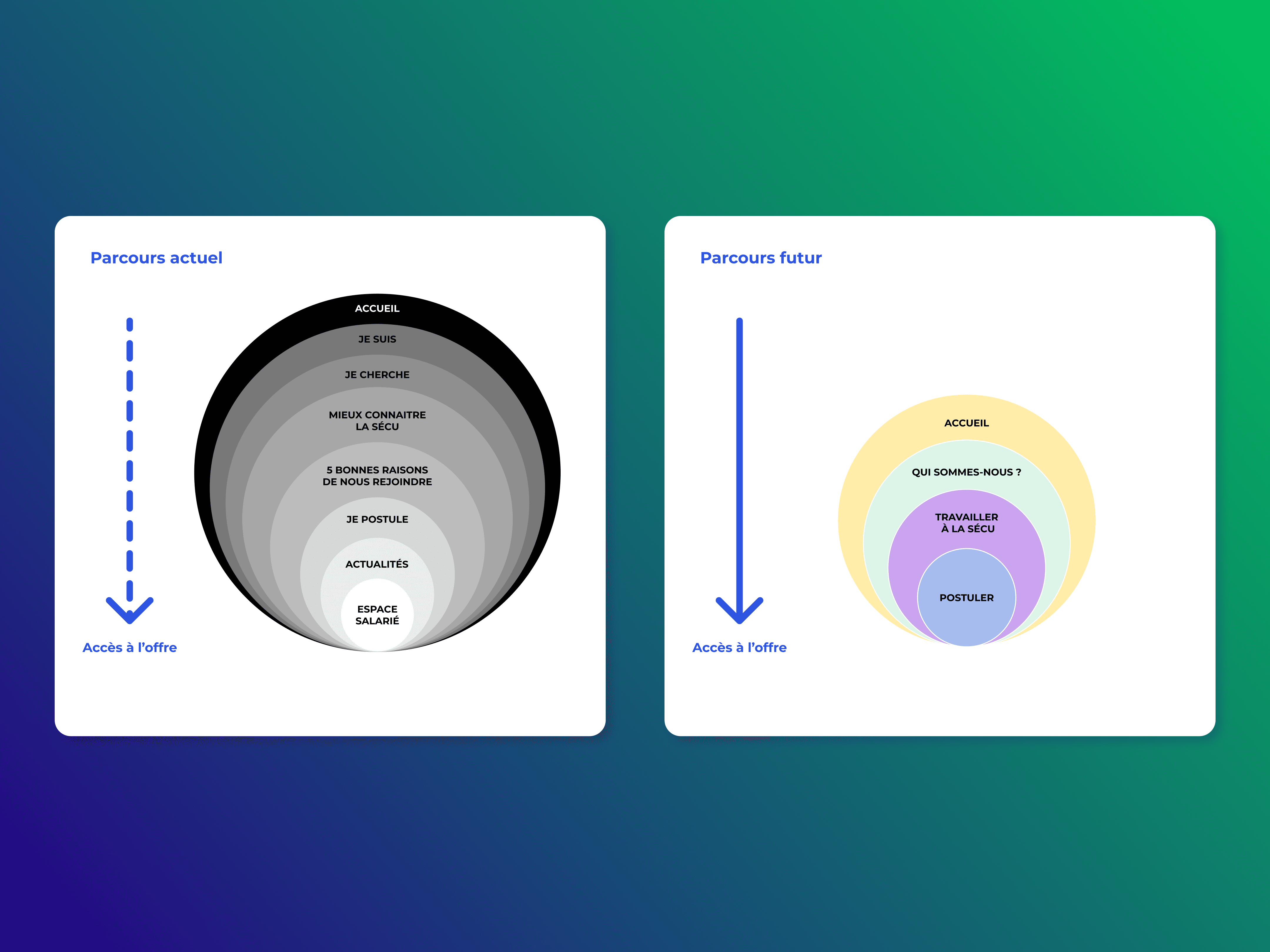
- Oignon Structure
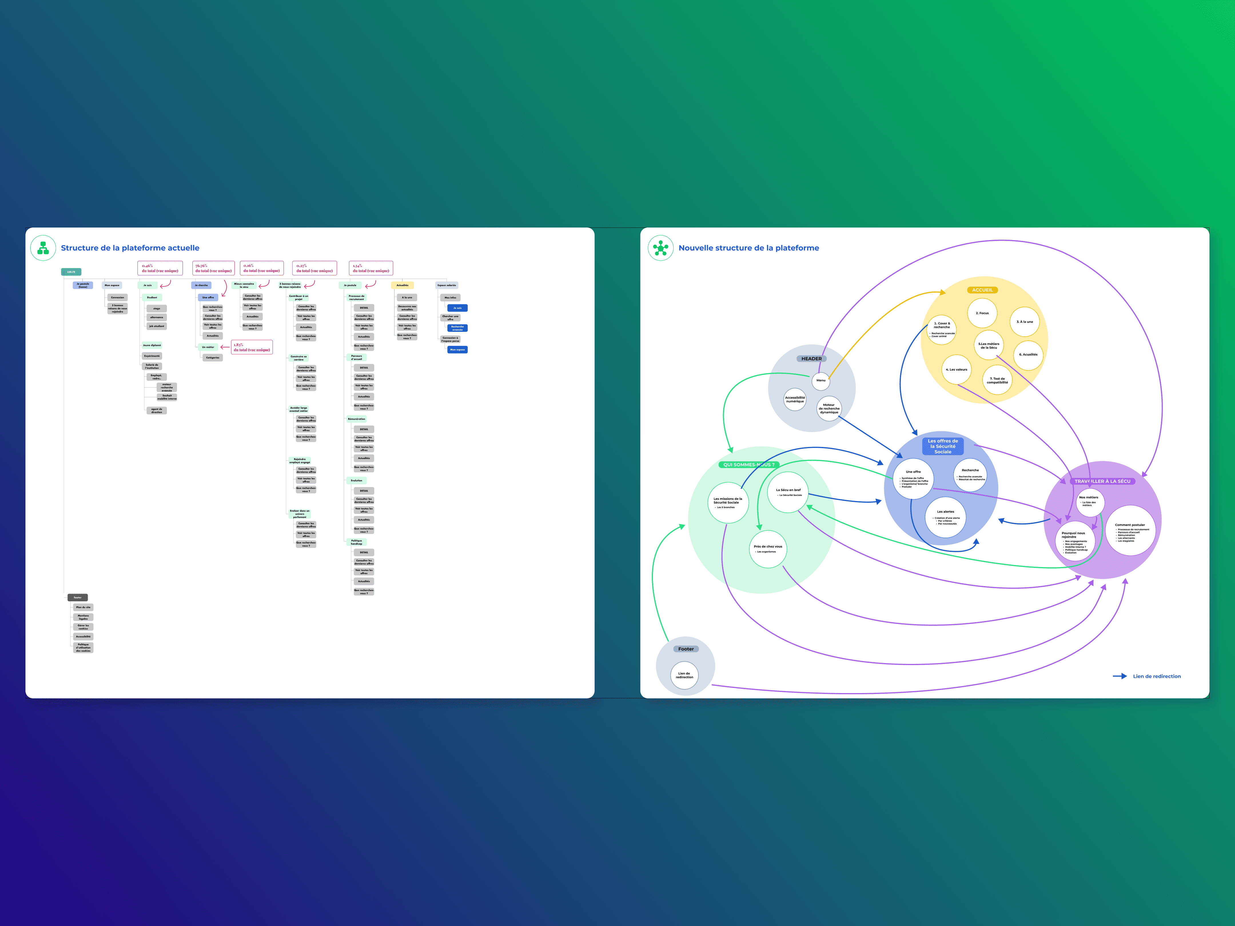
- Matrix
Following the redesign, the number of applications increased, while traffic remained constant, testifying to improved conversion, just like the paths.
Small stones lead to a good Design System
At the start of this program, there was no question of creating a design system, and we often hear from customers who want design systems without actually needing them.
For UCANSS, we knew that, in the long term, it would be relevant to take a systemic approach to interfaces in order to rationalize and improve product maintenance and relevance.
However, due to mandate and budget constraints, it was not yet possible to address these issues; to do so would require convincing and proving the value.
Bearing this conviction in mind, I wanted to capitalize as much as possible on the first redesign projects to improve the production velocity of subsequent projects; firstly on conception and design, and secondly on development.
Very quickly I wanted to include all stakeholders in figma to evangelize the approach and ways of designing. A modular approach? Components? Getting the right messages across to convince people.
As a result, the team and I initiated a kind of Design Kit aimed at simulating a mini Design System.
This approach, which lasted throughout the projects, gave us the first building blocks of what is today the French Social Security Design System. These first bricks were, of course, imperfect, yet their impact was very strong.
Today, UCANSS's product teams and IT department are highly autonomous in their use and maintenance of the system, enabling them to rapidly create, improve or even rethink its many products and services.
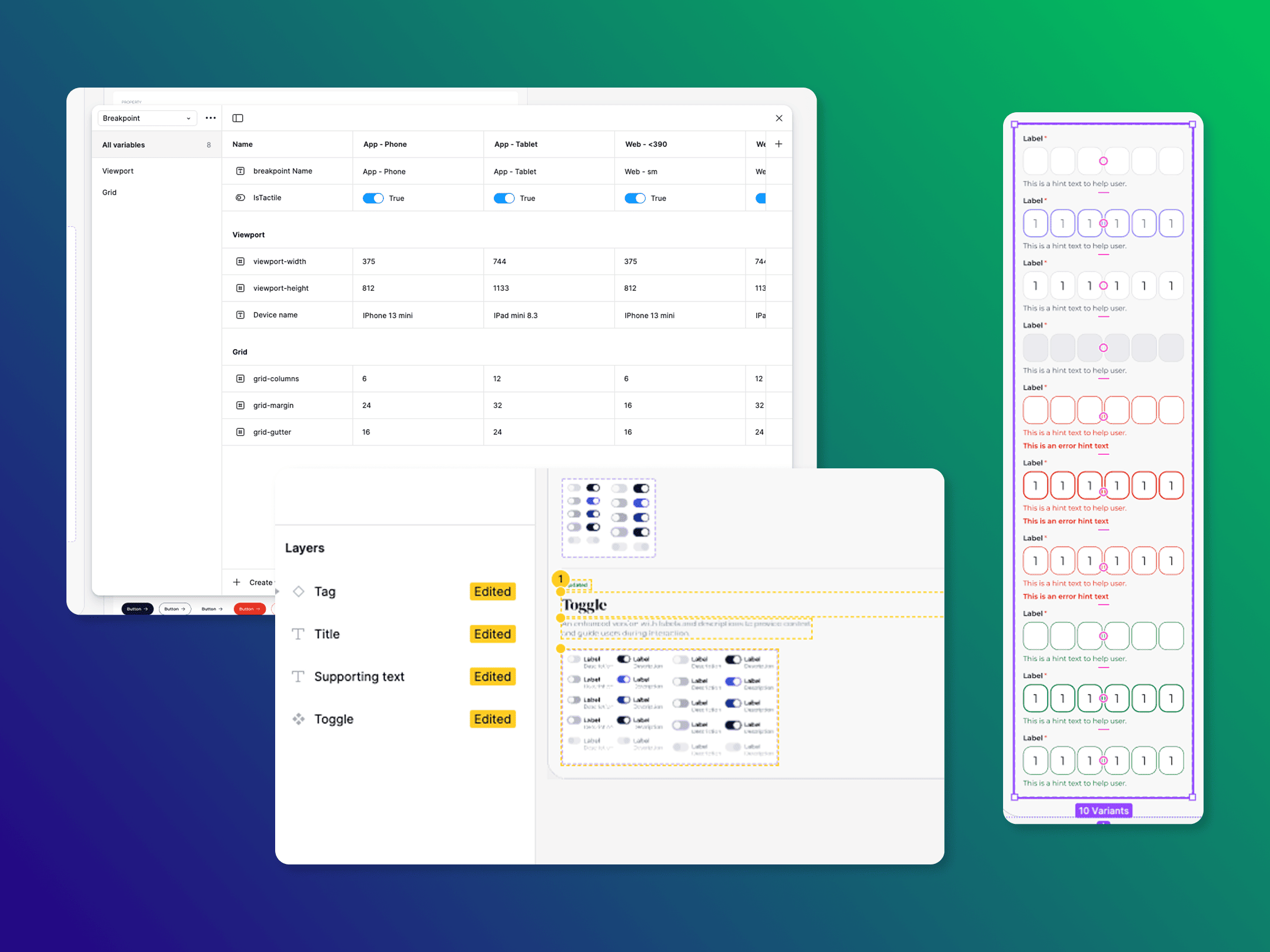
- Design System approach with variables & code
Accessibility for all
One of the biggest challenges, if not the biggest challenge, was to significantly increase product accessibility.
UCANSS being a public organization is legally responsible for ensuring accessibility.
Prior to the project, the entire Onepoint team was given a refresher course on the RGAA / WCAG. This was an opportunity to understand who is responsible for what, between the designer, the developer and so on.
We relied on:
- French government accessibility guides
- UCANSS teams' best practices
- OPQUAST web quality rules
In concrete terms, what does this mean for the site?
Nous avons mis en place une sémantique précise en terme de Design pour que cela colle à la sémantique HTML pour que les technologies d’assistances puissent scanner le site au mieux (e.g. keyboard friendly, voice over etc.).
Nous avons intégré nativement un panneau de contrôle pour gérer
- typography (dyslexia etc.)
- Contrast
- Line Spacing
The result? One of the first 100% RGAA-compliant sites in France.
👉 UCANSS Accessibility 🇫🇷 French Accessibility Guidelines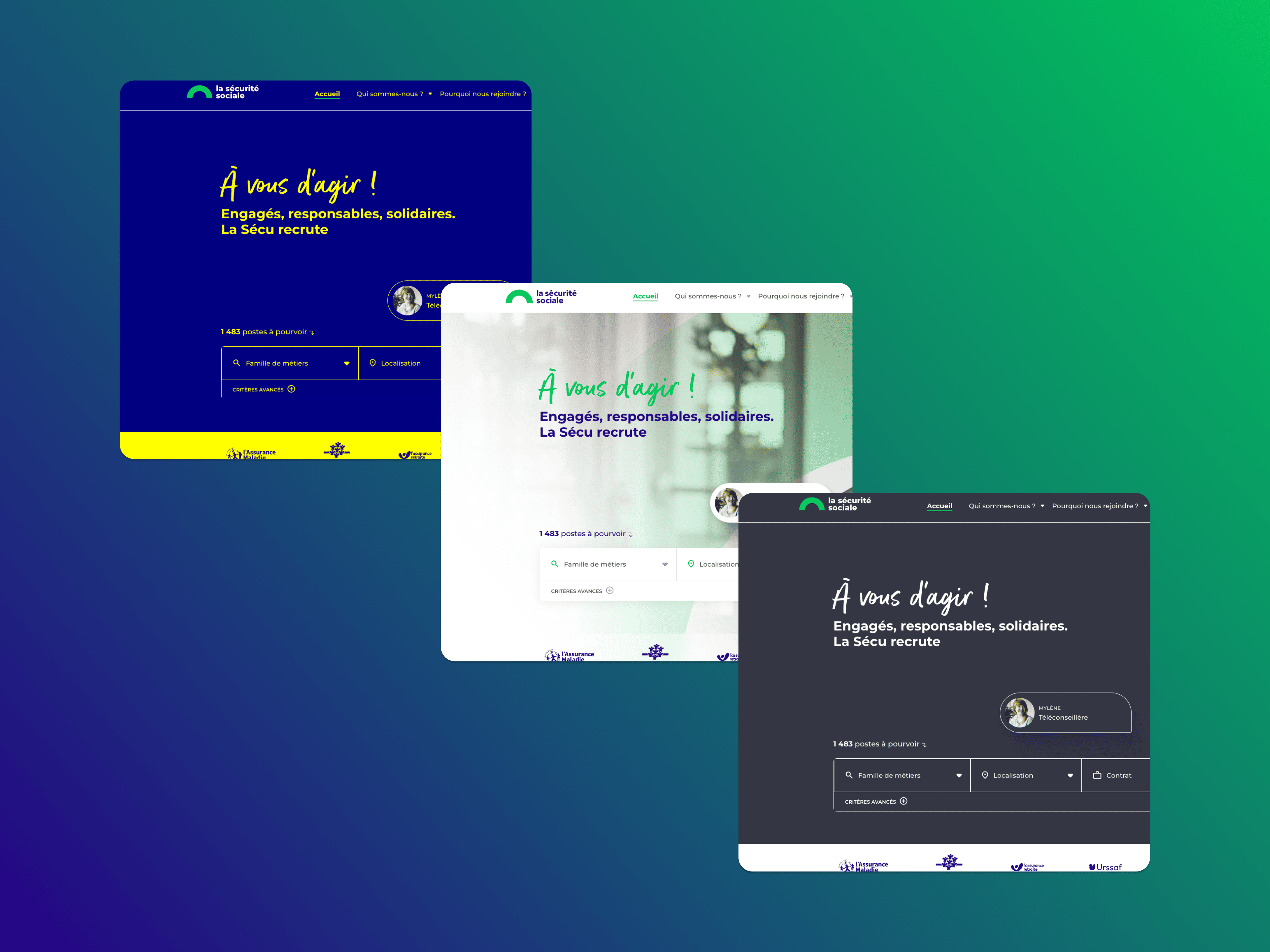
- Some accesibility modes around contrast
Avoiding gut feeling design
User testing is still one of my strongest convictions when it comes to consumer sites.
Why is this?
We put forward numerous design hypotheses, usage hypotheses, etc., but we have to validate or invalidate them.
The difficulty with user tests for products of this type: the target, which target to prioritize? the candidates can be very different and so we can very easily bias our tests with non-representative panels. To avoid this, I opted for a quantitative approach using a variety of path tests.
To do this, I suggested that the team use Maze
On the one hand, I was able to determine the appropriate user panel with the UCANSS teams, while working on the prototypes with my design team.
Our objective was to validate what was critical
- Applying on a computer
- Applying on a phone
- Finding out about the organizaiton
- [...]
In all, around a hundred respondents highlighted the efficiency of the job search engine and, above all, all the adjustments to be made.
I can't share the details of the reports, but as usual, the same rigor is applied. with a 3 stepped mantra
- Report: what did you notice from the testing
- Consequences: what are the consequences form this observation
- Recommandation: what do you want to adjust based on theses consequences
Maze is great tool, I recommand it.
- Noodling before conditional prototyping
Conclusion
This project opened my eyes to public sector organizations. Yes, I'd had previous experience in this sector, but never as comprehensive as this.
I was really able to put in place an entire design strategy, while supporting a client who, despite a reliable maturity in our businesses, had an exceptional willingness to learn.
Overall, I was able to
- Bring a high-stakes public project to fruition
- Lead and coach a complete design team (Product Design, Creative, Researcher etc.)
- Take a step-by-step approach - the overall UCANSS program didn't always have this cross-functional ambition, so I had to go step-by-step to deliver relevant products with the team.
- With the help of the UCANSS and Onepoint teams, achieve a perfect accessibility compliance score.
Some website from the program
👉 La Sécu Recrute 👉 Le Lab